
I’ve always been interested in statistics about everyday life. When playing video games, I would compulsvely check the stats page to see how many steps I’d taken, how much of the map I’ve explored. When we look back at our week, month, or year, it can be easy to have our view of it clouded by emotional responses or misrememberings.
As a way to combat this and get a more quantitative understanding of my life, my friend (who I shall refer to as Bob) and I began keeping Daylio journals. This is an app that asks you throughout the day how you’re feeling, and then asks you what activities you have done since your last update. The fantastic part is the ability to fully customise the emotions and activities that are your options.
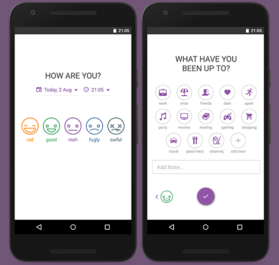
Daylio includes some stats and charts on your moods, plotting things like the frequency that you show each mood, and some simple correlations between moods and activities. However, there was certainly opportunity for a more thorough investigation, so I turned to Python, Pandas, and Seaborn to see what else I could learn.
Since his data was more well-structured than mine, I used Bob’s data for this investigation. But I have since seen which parts of his diary might lead to the most accurate insights (such as having a separate activity bubble for each number of hours slept) and incorporated them into my own.
This is the code for loading in the data:
And this is how the data arrives:

Changes in mood over time
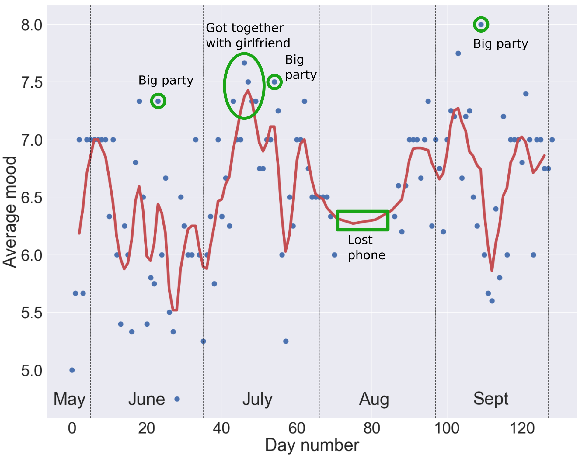
The first question we might ask is how his average mood changes day-by-day. To do this, we can’t simply plot the mood column, since most days have more than one entry. Instead we group by the day number, and average the moods within each day. A rolling average of the moods shows general trends over time. However, there is also clearly a lot of variation away from this mean, especially in June.
I’ve calculated the mean average and variance for moods in each month, and we can see that Bob is getting happier and more stable in his happiness over time.
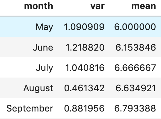
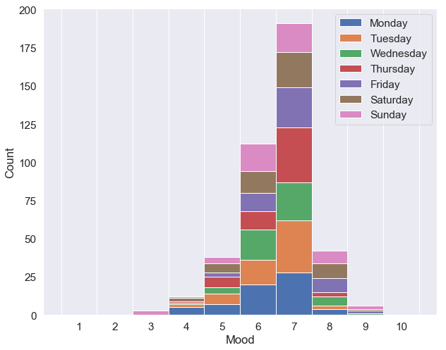
We can have faith that this is a real effect and not just a statistical anomaly by noting that the variance in our estimate of the “true” mean from a sample is given by $\sigma^2/(N+1)$ , where $\sigma^2$ is the sample variance, and N is the number of points in the sample. Since the differences between the means are typically greater than the variances/31, it is likely that he really is getting happier. Note that this formula for the variance in the estimate of the mean only properly applies when the moods are normally distributed, which the below graph shows is not quite the case, but we’ll just pretend it is for now! 😉
We can also identify different types of happiness. The period of time during which Bob was first getting together with his girlfriend represents one of the best periods of sustained happiness in the diary. On the other hand, big parties produce sharp spikes in happiness, followed by big drops representing the inevitable hangover!
His happiness is also partially dependent on the day of the week, as shown below, although the effect is small.
How do moods vary with the time-of-day or the weather?
While grouping the entries by day and finding the average gives us an easy way to compare trends over time, there’s no particular reason that we should expect moods to be consistent over the day.
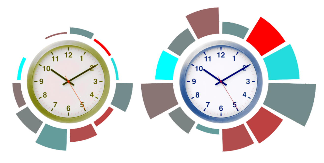
In the plot below, the size of each bar represents the number of diary entries that Bob made between the start and the end of the given hour, and the colour represents his average mood, with bright red being happier. The left clock is the a.m. hours between midnight and midday, and right is p.m. from midday till the next midnight.
And the code to produce it is here:
It seems there’s not a whole lot to tell here. Clearly he makes a lot more entries in the afternoon, but there seems to be little correlation with time and mood.
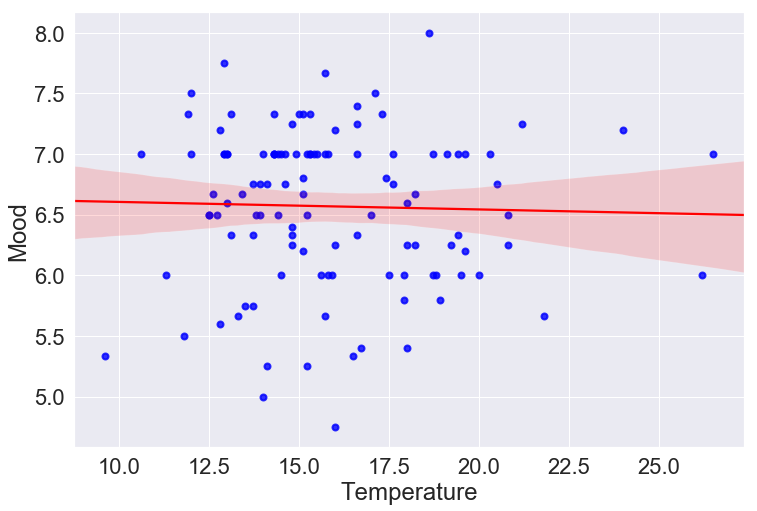
Speaking of things with little correlation, I had the great idea that perhaps Bob’s mood is high during sunny days and low during cold days. I know that weather is certainly a big factor in my own mood, so maybe it would be a good predictor here?
To check this I copied the daily temperature highs from the Bureau of Metrology, formatted them, and saved them into a dataframe, and compared them to the average moods.
There seems to be no correlation. This is also true when I looked at the last mood in the day, and the midday entry (rather than the averages). This is not particularly helpful when trying to build a predictive model of Bob’s mood, but it is good to know that his happiness is more based on internal states and more concrete life events, rather than the whims of the weather.
Which activities affect Bob’s mood the most?
While time-of-day and weather show little effect on his mood, the most interesting question is surely how much the different activities affect his mood. For example, if Bob comes to the end of a bad week, it might be a comfort for him to be able to see that the activities he’s partaken in are statistically likely to result in a bad week, and that the activities he’s got planned for next week typically result in a better spirit.
How can we say whether an activity has a positive effect, a negative effect, or none at all? The simplest metric would be to split the days into two groups – ones where the activity took place, and ones where it did not, and look at the average moods of each type of days. Of course, this does not take into account the variance in these moods, or the number of days in each group.
A better approach would be to use something like a t-test based on the sample means and variances. However, this faces two issues. Firstly, a t-test typically assumes that the data follows a normal distribution, which is not the case here. Whilst this was not particularly important when we were identifying general trends in happiness over time, here we want to make a much more quantitative assessment that the probability that the difference in moods between doing an activity and not doing it is due entirely to random chance (i.e. we want to calculate the p-value). We therefore want a method for evaluating the p-value that does not rely on a particular data distribution.
Additionally, there is an issue about the psychology of happiness states to consider. If Bob rates Monday, Tuesday, and Wednesday as 6, 7, and 8 respectively, it is perfectly sensible to conclude that Bob’s mood increased throughout the week. However, it is a lot harder to say whether the difference in Bob’s mood between Monday and Tuesday was the same as the difference in mood between Tuesday and Wednesday. We, as humans, are quite good at ordering our moods, and saying that one day is better than another, but it is significantly harder to meaningfully say how much better one day is than another, and it is even harder to be consistent with this over time.
Non-parametric p-values
A statistical test that fits these requirements is the Mann-Whitney U-test. Here, we gather together all N observed moods and put them in order. We assign a rank to each observation, from 1st (smallest) to Nth (largest). We then collect together all observations which represent the moods of days on which Bob did do some given activity. We add together just those ranks, to get R. Now, if we let N1 be the number of days on which he did the activity, and N0 the number of days on which he didn’t (so N=N1+N0), we calculate the U-statistic, given by:
$U = R - \frac{N_1(N_1-1)}{2}.$
For large N, U (under the null hypothesis) is approximately normally distributed. Although since we are not using large data sets, we will use SciPy’s built-in function to find the p-values, which is imported by:
from scipy.stats import mannwhitneyu
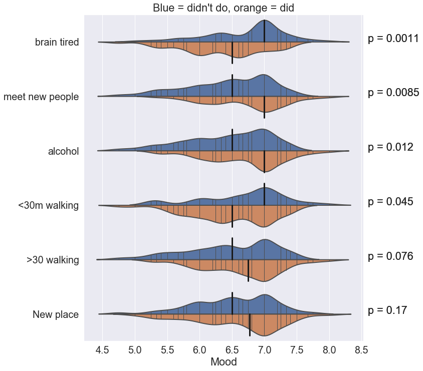
Below we see the distributions of the activities which exhibit the smallest p-values. Note that both “< 30 minutes walking” and “> 30 minutes walking” are separately represented. This is because the union of these two activities does not cover all days. There are days on which neither entry was selected, and for which we have no information on the amount of time that was walked. However, the fact that both of these turn up, with “> 30 m” increasing the mean happiness and “< 30 m” decreasing it, gives strength to our belief that walking is a key contributor to happiness.
Multiple p-values
The statistically-minded amongst you might notice the fallacy of concurrently measuring p-values for lots of different variables. In particular, here we have looked at the p-values for the top 10 most common activities, and reported those with p<0.25. This is a high threshold by any scientific standard, with p<0.05 being the usual threshold for significance.
In addition to many other problems with the p-value, there is the issue that we are much more likely to identify random noise as statistical significance when making multiple independent tests. With a cut-off of 0.05 and 10 tests, then the probability that we would see a significant result is
$p_\text{overall} = 1-0.95^{10} = 40\%,$
even if the data were all completely random. In order to maintain an overall p-value of 0.05, we would need to look for an individual-test p-value of 0.005. Under this interpretation, “brain tired” is the only activity which we can say with statistical confidence has an effect on Bob’s mood.
Speaking of which…
Mood and tiredness
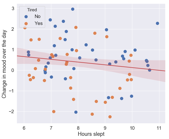
Finally, I wanted to investigate the effect of the number of hours slept on Bob’s mood. Luckily, Bob had the foresight to include activities such as “7 hours slept”, “8 hours slept”, and so on. This is in addition to the activities indicating “brain tired” and “body tired”, which I grouped into a single category of “tired”.
Bob and I thought that it might be the case that when he was tired, his mood would quickly deteriorate over the day. This is measured by a column which calculates the difference in mood between his last entry of the day and his first entry.
Here we see the effect of the number of hours slept on this change in mood. Surprisingly, more sleep seems to indicate a quicker deterioration in mood. Note that even the most positive estimate within the 95% confidence interval (shown in light red) shows a negative correlation. Interestingly, there is not particularly any correlation between the number of hours slept and Bob’s tiredness.
Conclusion
While keeping a diary is a fantastic way to learn about yourself, one can gain much more unexpected and rigorous insights by taking a quantified approach using an app like Daylio.
However, these insights have been largely descriptive, rather than predictive. For example, I tried to train various machine-learning algorithms on Bob’s set of activities to try to predict his moods, and none of these came up any better than just randomly guessing. This seems to confirm what we initially suspected – that while such an analysis might give us a good snapshot of someone’s life, a person’s happiness is much more often determined by the little subjective things that aren’t so easily measured.

